The brief
Raising Happiness with WA’s iconic parenting brand
For many West Australian parents, Ngala is a household name. The organisation is a go-to destination but the brand itself was facing an identity crisis that saw their 130-year-old organisation perceived solely as “just a baby sleep clinic.” There was also a feeling that the brand’s visual identity was too clinical. It lacked heart, meaning, and a holistic brand story.
We were looking for a brand identity that would really resonate and tell our Ngala story
Yvonne Tessensohn, Brand and Marketing Manager, Ngala
The deliverables:
- Strategic research and brand positioning
- A compelling and enriching brand story
- A new tagline for the brand
- Visual brand re-design
- Brand style guide including photography style guide
- Brochure, letterheads, and business card templates
- Ongoing communications and content plan
Our answer
The art of research-informed branding
Upon winning the pitch against three other top tier agencies, Lush’s strategic team began the deep research required to reposition the brand.
We needed to get into the hearts and minds of this generation of WA parents, Ngala employees, and key stakeholders in order to create a brand that everyone could connect with. Ngala prides itself on being an evidence-based organisation, so we really needed to balance the IQ of the brand alongside the EQ that millennial parents were seeking.
Brendon Lobo, Client Services Director, Lush.
The strategic brand work gathered insights from a staff workshop, one-on-one interviews, online parent surveys, stakeholder engagement, and consumer research. This research-based approach continued through to the creative process with tagline testing.
Creative testing is always a big part of our process and Ngala’s new tagline required input from parents all over Australia. It was really remarkable to see just how symbiotic the responses were around one direction in particular; happiness.
Michael Drysdale, Lead Creative Strategist, Lush.
The results
A tagline co-written by the audience
The tagline, Raising Happiness, meant something different to almost everyone who read it. For some parents it meant meeting certain developmental milestones, for others it was having nourishing social engagements, finding purpose in their lives, and yes … even getting a good night’s sleep.
The tagline itself has become the linchpin of Ngala with all of our external stakeholders, from the parents to our supporters, our funders, our supporters. It’s a tagline that really resonates with everyone.
Yvonne Tessensohn, Brand and Marketing Manager, Ngala
The essence of the tagline was then developed into a longer narrative and became the brand story for Ngala:
The story of Ngala is a community story. It’s the future of Western Australian families who are guided by our 129 years’ experience in parenting and child development. This guidance has the power to give parents and carers a sigh of relief, a feeling that they’re in safe hands with our team. But this is just the beginning. We believe that parenting can be a joyful and rewarding experience, while children are given the best opportunities in life. This is what we call, Raising Happiness and it takes a village.
As a connected team of parenting professionals across WA, our actions towards Raising Happiness are based on research, evidence, and learned experience in this space. Your children will face challenges, seek out opportunities, and triumph over hurdles, all the while discovering their world. Ngala is there to support you on this journey with your child, every step of the way.
In the same way that your child’s world is made up of a collection of experiences and encounters, our story includes all the people who make up Ngala, including you. You are the story of Ngala. You are Raising Happiness.
Visualising the brand identity
The colour pallet, font style, logo design, and photography style all worked together to create the new visual brand identity for Ngala. The colours were inspired by the native flora surrounding Ngala HQ and the iconic hues of the West Australian sky, while the logo represented the union of parent, child, and community (of which Ngala is part).
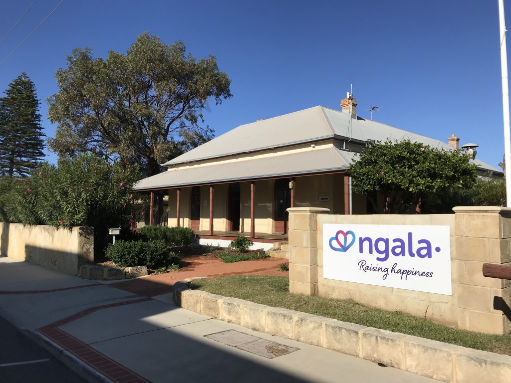

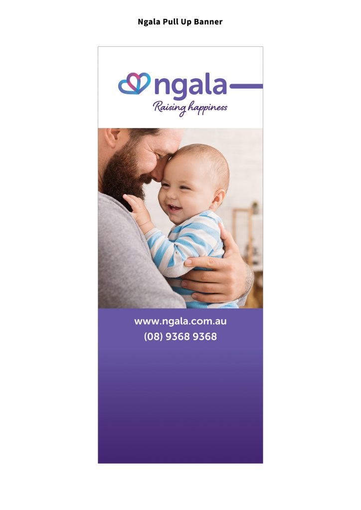
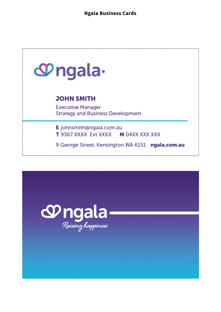
This visual brand identity, combined with the written assets, modernised the historic WA brand and empowered Ngala to connect with a new generation of Aussie parents.
