
Infographics are an incredibly effective tool in visual storytelling, but they are often overlooked in content marketing strategies.
Here’s why you should no longer ignore them.
Not only are they a great way to condense complex information but they also make statistics pop off the page, they are memorable and engaging for the reader, and they can make a particular emotional impact that words sometimes can’t. On top of this, the brain processes visuals faster than words, which means you are grabbing user attention quickly. To find out more, visit this impressive piece by NeoMam Studios. In an infographic format, no less.
So what’s stopping you adding infographics into your marketing communications?
Often it’s the case that we don’t possess the design skills necessary. While hiring a professional graphic designer is your best bet, if you don’t have the budget, there are plenty of programs available that help you create infographics in-house. Give Piktochart, Visme, Canva, Easel.ly or Venngage a try. They have a variety of templates to experiment with. You also should think about what kind of infographic you want. Is it a timeline? A how-to or a comparison? A map or a numbered list, perhaps?
Here are eight infographics that demonstrate how effective the format can be.
1. The world’s most dangerous animal
Proving that you don’t need lots of data, this striking infographic uses plenty of white space and minimal text, yet it is a hard-hitting message in its simplicity. This example, published on Bill Gates’ blog as part of Mosquito Week, was heavily shared and generated a lot of conversation when it was first published.
![]()
Credit: Gates Notes
2. One hour after drinking a can of Coke
Created by The Renegade Pharmacist, this infographic was based off a 2010 blog written by Wade Meredith on the website Blisstree. We all know that sugary drinks and junk food have a negative impact on health – it’s been written about countless times – but do you really know what happens after you drink a fizzy drink? This example has broken it down in a far more interesting way than an all-text list would have done.
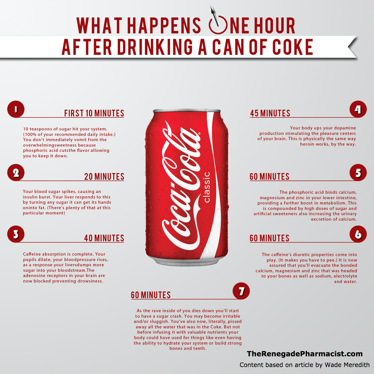
Credit: The Renegade Pharmacist
3. Is it too late to start your own business?
Information design team Anna and Mark Vital created this for Funders and Founders. Each age group is clickable and expands to reveal the names of well-known inspiring people and what age they were when they started their business. See the full image here. And for the record, the first age listed is Michael Dell of Dell at 18 and ends with Charles Flint of IBM at 61.
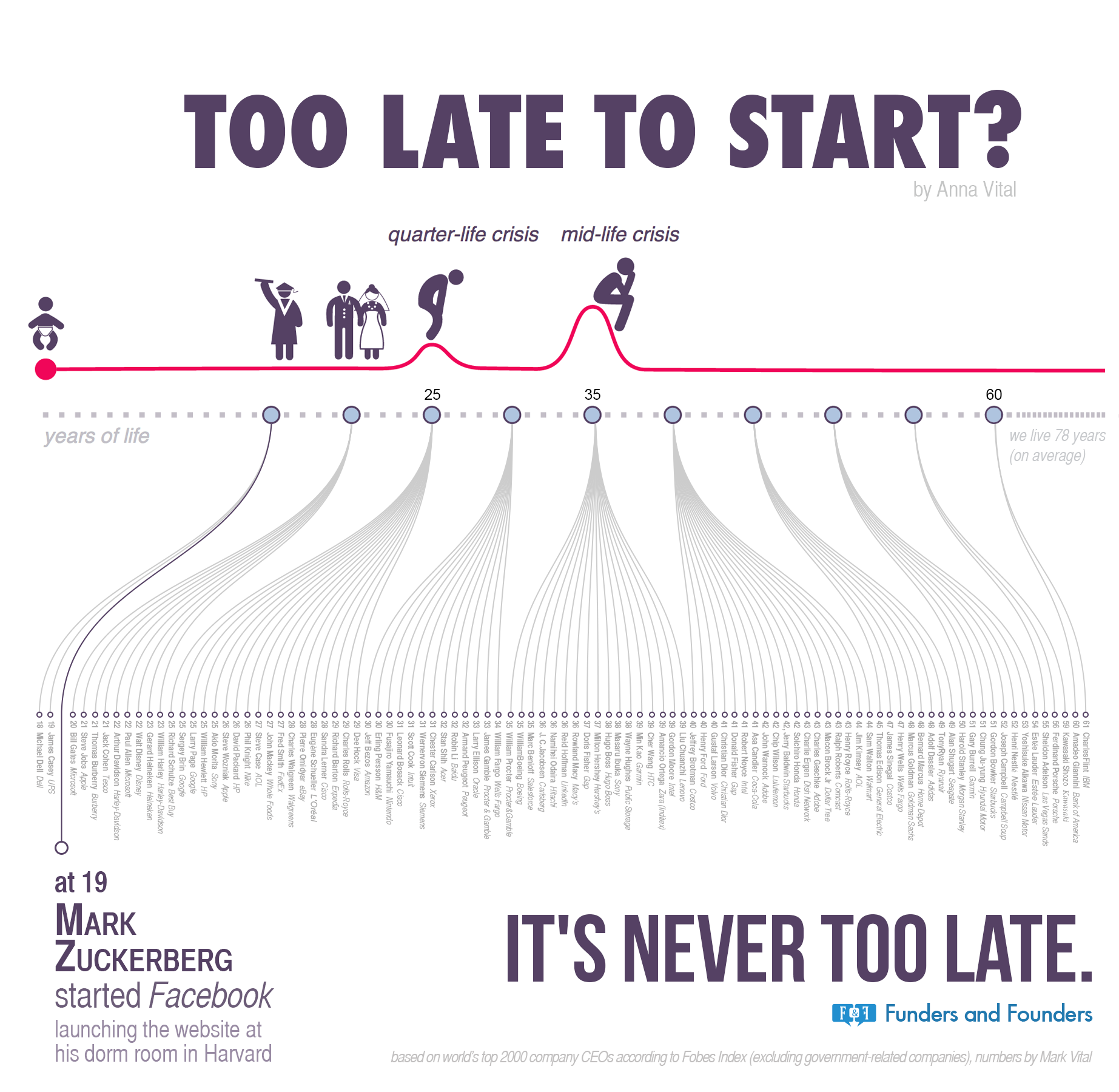 Credit: Funders and Founders
4. Branding colour guide
This shows that you don’t need to have complex information in an infographic. This colourful, cheery image by The Logo Company is highly sharable, and indeed, has been shared and replicated many times. There’s no doubt this would have had far less appeal if it was worded instead.
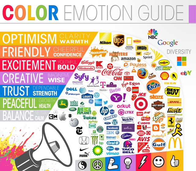 Credit: The Logo Company
5. How Australians save money
The government-run Money Smart website has created a series of infographics on topics that are typically not the most alluring (unless, of course, you find reading about finances thrilling). These include savings habits of the general public and how people use their tax returns. Thankfully, all the infographics are both informative and interesting. To access the full How Australians Save Money graphic, visit the Money Smart website.
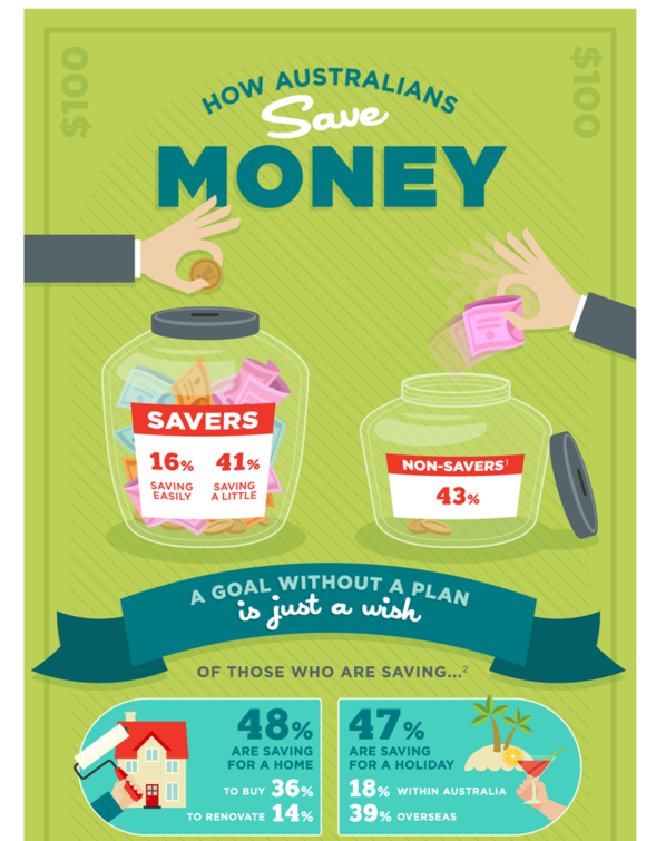 Credit: ASIC’s Money Smart
6. How music affects driving
This is quite a busy infographic that crams in a lot of material on one topic: how music affects driving ability. However, for the amount of data it contains, it is well set out and engaging from the first word to the final. To see the full infographic, visit the No Nonsense Insurance website. As with the previous graphic, this is a good example of how a sometimes dull topic can be put into a format that is appealing and educational to boot.
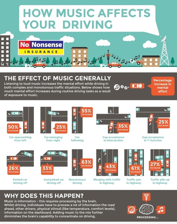 Credit: No Nonsense Insurance
7. Dwindling food varieties
Unlike the previous infographic, this image from National Geographic about the reduction in crop variety contains far less information. But in many ways, the message is more powerful.
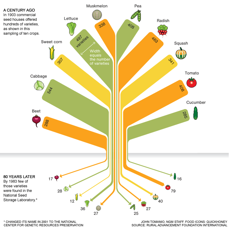
Credit: National Geographic Magazine
8. Home renovation tips
Allianz Insurance Australia created an image-heavy graphic that provides handy home renovation tips. In a clever piece of content marketing, the insurance giant avoids dull sales pitches and lengthy paragraphs about the virtues of home insurance and instead acts as a pointed example of what great content marketing can be. You can find the full infographic here.

Credit: Allianz Insurance
To discover the types of content marketing you should implement in your business strategy, contact us at Lush – The Content Agency.