
We recently wrote about how blogging can seem like a very simple thing to do. We also talked about how the reality can take people by surprise, because there are so many other facets to consider to produce a blog that really sparkles.
In Part 2, we cover even more blogging blunders that need to be avoided if you want to be successful:
Inconsistency
It doesn’t matter if you publish three blogs per week or one per month; the point here is that you must be consistent with the output. When visitors come to your site and see that you publish haphazardly, it tends to look lazy and as if the blog is just an afterthought. Consider this: would you sign up to follow an organisation or seek them out specifically for information if you aren’t even sure they will have the material? Most likely you would search for the site that you know for sure will have the information at the ready.
[tweet]It doesn’t matter if you publish three blogs per week or one per month – you must be consistent.[/tweet]
An editorial calendar is invaluable in helping you keep on top of this, as it will keep things organised and act as a little reminder that you have something due. You could use something as simple as a Word document to have the idea, the due date and the publishing date written down. A good tactic to follow this up with is to use an online scheduling system such as CoSchedule. This site will allow you to upload your blog and set in advance all your social media updates that accompany it.
These two together — the editorial calendar and the scheduler — allow you to take a step back and see any blog themes that are emerging or important ones that are missing.
Using a story topic just once, from one angle
In a former life I was a journalist. In that profession, you have to be able to extract several story angles from one topic. This tactic should be used in blogging too. Not only will you produce a lot more content without reaching for completely new topics all the time, but in general your content will be more well-rounded because you will have covered a topic thoroughly from all angles.
When you can’t think of any ideas, look back at what you’ve previously written. You might have referenced a good piece of research that can be expanded on, a particular dot point that could be the star of an article on its own, or you might find you have a few ‘but why?’ or ‘how is this so?’ questions.
A good example is the weight loss genre. If you were just covering the core issue of weight loss, of course you would write about calorie deficit. But there’s much more to it than that. What about these spin-offs that come from that one topic:
- Is one calorie really one calorie across the board, or does it depend on whether it’s a calorie of fat, carbohydrate or protein?
- What impact does real sugar versus artificial sweetener have on the brain in terms of feeling full?
- What role does psychology play in weight loss?
- How do you know what the calorie deficit is for you, as an individual, to lose weight?
- Does exercise speed up the weight loss process?
You can easily apply this to your business situation, too, because there are so many different angles you could take on any topic. It doesn’t matter whether you are in finance, a manager in a hospital or a children’s book blogger — you can still come up with an endless supply of stories. I keep a little notebook on me and write down any half-baked ideas that come to me (and sometimes they’re exceptionally half-baked to the point where I question whether I wrote it down in my sleep). If I don’t have my notebook handy, I use the notes app in my phone.
Writing down things allows your mind to stew on ideas, and you will be surprised at the kind of connections it can make when you’re not overthinking things and under pressure to come up with a great blog idea.
Font style: what not to wear
Your words must be as readable as possible. This may seem mind-numbingly obvious but you’d be surprised how often font is overlooked in its importance. For example the lovely swirl-type fonts may be lovely, but readers’ eyes are going to be strained after a while.
These style fonts should be used sparingly and used alongside one that is easy on the eye. The key is to find fonts that truly complement each other. There’s no need to go to design school for this; a program like Typegenius will do it for you. Nominate a font you already have your eye on and you’ll receive several pairing options. Plus, it will show you a website which has used the duo.
For example:
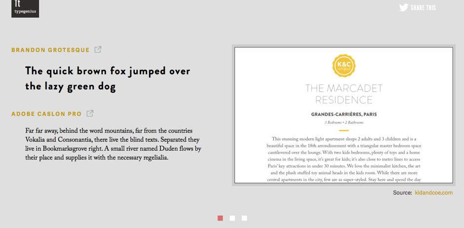
There has been considerable debate as to whether a serif or a sans serif font is better suited for the web, with many people siding with sans because it is supposedly easier to read on a screen. What is ‘sans’ exactly? It means without, so these are the styles that are without the little tails on letters. Think Verdana, Helvetica and Arial. The image above uses sans serif in the top example, and serif in the bottom.
For very small fonts or writing for children, sans would arguably be better. But titles or company names are usually fine to be in either. Newspapers traditionally used serif fonts, and even after moving online, many have stayed true to their serif style without turning readers away. So regardless of the style you choose, ensure it is not too small, it is ‘clean’ looking, there is enough spacing between letters, and there is a good contrast between the writing and the background. Busy backgrounds can be distracting and uncomfortable for the reader.
Creating a successful blog doesn’t have to be an exhausting task. With time and practice, you will begin to see what works for you and your organisation. However, if it’s your writing skills that need to be upgraded, take a look at our Masterclass: Write Like a Marketing Pro, the half-day workshop for anyone in communications. Learn from experienced journalists and marketers. You can find out more here.